Generate awareness
Capture leads
Guide them
Allow them to take action
Your website is one primary tool in your business that should be working for you to grow your list and get paying clients so you don’t have to work so hard for each sale or buyer.
There are 7 simple best practices to create a high converting website and marketing machine that:
- attracts the right people,
- engages the right prospects and
- converts your ideal clients.
#1 Be Consistent In Your Branding
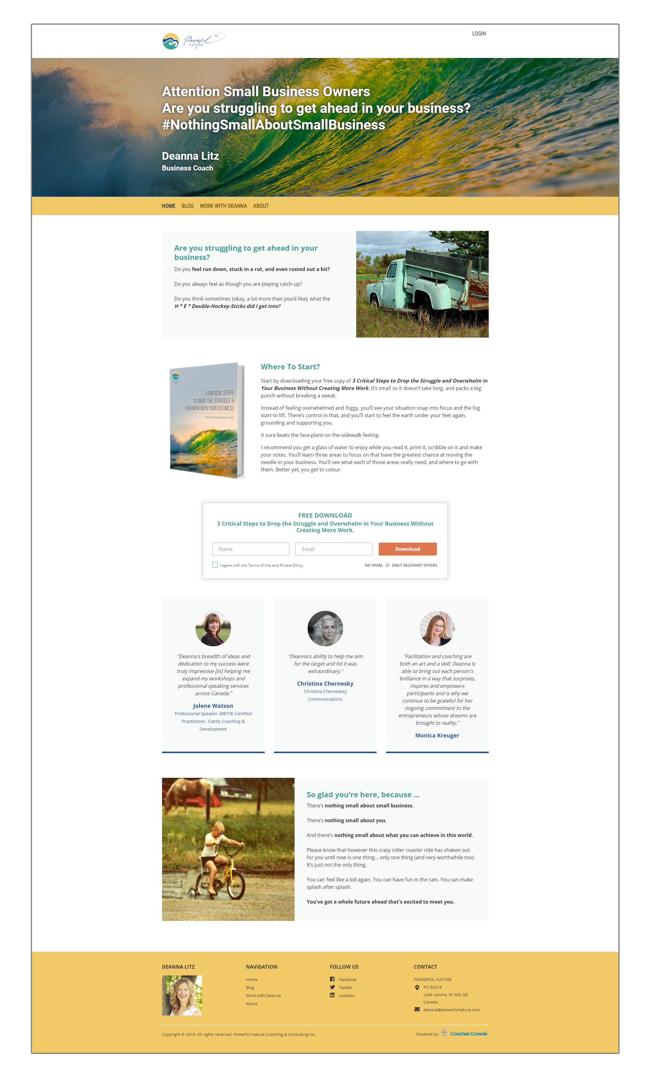
While your website’s focus is always on the ideal audience you’re attracting and converting (which we’ll get more into in best practice # 3), the identifying elements of your website (your logo, your colors, your images, your font styles) need to be consistent and simply displayed, giving the visitor an enjoyable experience.
Your name and / or logo should be located in the upper left corner; not obtrusive and not taking up too much “real estate” on each page. While you love your logo and it’s part of your identity as an entrepreneur, your visitors are more interested in what you can do for them rather than what your logo looks like. Be consistent so it appears on each page.
Pictures convey a 1,000 words and are ideal to use on pages of your website. They should be intentional and bring forth an emotional experience for the visitor that relates to the written words expressed on the same page.
For Coaches Console users we’ve set up various Theme templates that easily allows you to select your branding and insert your logo that follows these best practices! We’ve got you covered!
#1 Be Consistent In Your Branding
While your website’s focus is always on the ideal audience you’re attracting and converting (which we’ll get more into in best practice # 3), the identifying elements of your website (your logo, your colors, your images, your font styles) need to be consistent and simply displayed, giving the visitor an enjoyable experience.
Your name and / or logo should be located in the upper left corner; not obtrusive and not taking up too much “real estate” on each page. While you love your logo and it’s part of your identity as an entrepreneur, your visitors are more interested in what you can do for them rather than what your logo looks like. Be consistent so it appears on each page.
Pictures convey a 1,000 words and are ideal to use on pages of your website. They should be intentional and bring forth an emotional experience for the visitor that relates to the written words expressed on the same page.
For Coaches Console users we’ve set up various Theme templates that easily allows you to select your branding and insert your logo that follows these best practices! We’ve got you covered!
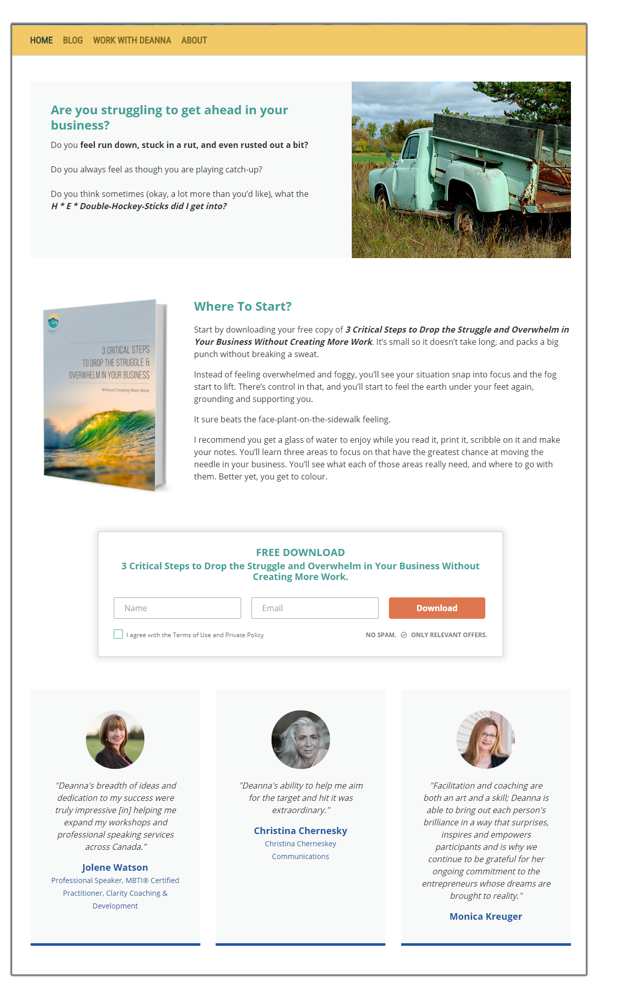
#2 Easy To Read Content
When creating your pages the experience of the visitor should ALWAYS be top of mind. Be sure to leave plenty of white space on your pages. More does not mean better in this case when it comes to text. Less text and more white space.
Your margins, the spacing between headers and each paragraph – that’s the white space on a page. The white space is what allows a visitor to easily move from one section to the next without creating a chaotic energetic feeling that causes the visitor to want to leave. When you insert white space it has a calming effect and the visitor can take in and process the messages you have on each page they’re visiting.
 Pro Tip: The Golden Rules of Bolding. To Bold or Not to Bold – that is the question. With the thousands of coaches my team and I have worked with over the years to help them launch and grow their coaching businesses, so often we see coaches going bold crazy! Avoid that trap!
When it comes to bolding, follow these 2 simple rules:
- Bolding Rule #1 – When you sit down to write the copy for your webpage (or newsletter, blog post, email, etc) first think of the 3-5 main points you want someone to know about the topic you’re creating the copy for. At the end of the day, what is it that you want them to walk away knowing? Write those down = these become your headlines on your page/in your article. THEN you fill in the text within each section.
- Bolding Rule #2 – Bolded phrases must make sense by themselves. After you’ve completed your page or article, give it the read-through test. Start at the top of the page with the title or heading of your page and then just read all the bold phrases included on your page. They must make sense standing alone, without any other text.
When a visitor comes to a page they do three things: (1) They glance at the imagery on the page then they (2) read the bolded phrases… At this point, IF they like what they see/feel and read (in the bolded statements) THEN they will make a decision to read the whole thing.
Don’t go bold crazy! Be intentional about your bolding.
#3 WIIFM – “What’s In It For Me”
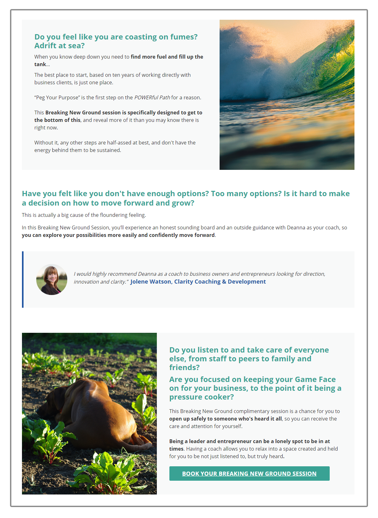 That is what every visitor is thinking to themselves when they come to your website (or hear you speak). Your visitors, a.k.a. your ideal potential clients, have a problem they’re struggling with that you potentially can help them solve. They want to know if you can help them and if so, what’s in it for them – what are the results they’ll experience in interacting and potentially hiring you.
WRITE FROM THE VISITORS’ PERSPECTIVE! I cannot say this enough. This is THE #1 most important part of your website and ALL your marketing and networking!
In order to do this, you must:
- Know your audience – their challenges and their desired results;
- Use language they relate to and resonate with;
- Incorporate result-based language in your calls-to-action (menus, links, buttons).
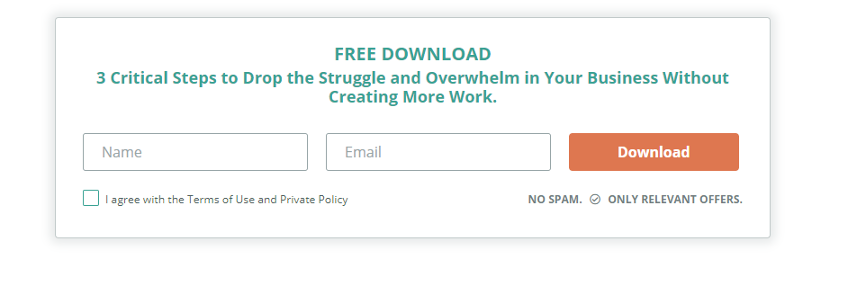
Pro Tip: When inserting buttons at the bottom of an opt in page, rather than labeling it “Click Here” use the result-based language of “Get Your Free Copy Now!”
#4 FOCUS FOCUS FOCUS
“A confused person never buys!”
I’ve seen so many coaches and entrepreneurs make the mistake of putting too many options on a page for a prospect to take. It overwhelms them and causes confusion, so the buyer goes elsewhere. Often, the mindset driving this line of thinking is:
“I have to tell them everything I do right up front on the homepage so they know all the different ways they can work with me.”
 That’s fear based thinking and it’s all about you and your services (revisit #3 above). Instead, give them a popcorn trail that is easy for them to follow.
Ideally you would have only ONE call-to-action on each page; but no more than 3.
Your opt in page ONLY gives them the call-to-action to enter their contact information and opt in.
On your homepage you may give them 3 options:
- An opt in form so you can collect their contact information and grow your list,
- A scheduling button so they can book a sample session with you,
- Access to the About page and/or client stories (Case studies/testimonials).
The website themes and templates in Coaches Console make it easy for you to create a full website and/or simple landing pages for lead magnets, registration, opt in forms, sales pages
#5 Social Proof
 Stories are your best marketing!!! This is my favorite type of marketing. When I share stories I’m not selling! It’s more engaging and people can self-identify and make clear choices in working with you when they know others have had success with you as well. Stories demonstrate what is possible for them and it gives them hope!
On each page of your website insert various types of social proof. Some examples would include:
- Screenshots from Facebook comments of clients sharing successes and raving reviews about you;
- Short written and/or video testimonials from clients;
- Case studies that write out (or video) the entire journey of the clients – from struggle to success – and capture the emotional journey and the impact of the results on the client’s life.
Other forms of social proof include things like “As seen on” and listing places where you were featured: podcasts, reports, TV broadcasts, etc. You can also include certifications on your About page and always include your contact information ideally in the footer of your website, but also on a Contact page.
 #6 Mobile Ready
Studies show that now over 50% of the people that interact with your website will do so from a mobile device. Be sure your webpages look good and function properly no matter where a visitor is viewing from. The good news for Coaches Console users is that we’ve built this right into the themes of your website templates!
#7 Secure!

It almost goes without saying in this day and age that your website must be secure to prevent others from hacking, etc. And by secure, I’m not just talking about your private client portal (although that is another great level of security). I’m talking about the public pages of your website. They don’t have to be private, but they do have to be secure, so you see the little lock icon in the web browser when people come to your site. (And in case you were wondering, yes, Coaches Console websites are secure).
- generating awareness through the content you put on your pages (best practices #1, 2 & 3 above),
- capturing leads (best practice #4 above),
- guiding them towards making a buying decision (best practices #4 & 5 above),
- and finally with allowing them to make a buying decision (best practices #4, 5, 6 & 7 above).
ANNOUNCING…
NEW Coaches Console website templates and themes
that are pre-built and ready for you to use!
Check out WHAT’S NEW so you can be sure to easily integrate these trends and best practices into your website and marketing to get the best conversions possible!
Be proud of your marketing and website!
Be confident in putting yourself out there!